Airegin Extended gives the line a wider field of attention. The proportions slow the rhythm, opening space for display scale, identity presence and editorial statements that need horizontal authority. In paragraph use, the challenge is balance: broad letters must not become loose, spaces must stay active, and punctuation has to hold the sentence together across a longer sweep. This setting tests that tension with capitals, lowercase, figures and accented names moving through the same generous measure. The result should feel expansive rather than inflated, assertive rather than loud, with enough discipline to carry both a poster headline and a composed block of text.
AIREGIN EXTENDED
Choose a licence
Editorial Overview
Airegin Extended opens the Airegin drawing horizontally for wide display settings, assertive identities and compositions that need breadth.
This specimen focuses only on Extended styles, expanding proportions for signage, headlines and brand systems with a confident horizontal voice.
Ideal for expressive logotypes, wide posters, editorial openers and spatial identity systems.
Use it when a brand needs wide typographic presence across headlines, signage, campaigns and large-format compositions.
Font Family: Airegin Extended
Classification: Extended Grotesque
Release: 2025
Design: Guillermo Gil
Foundry: EntasisType
Form & Rhythm
Horizon
Wide
Span
Surface
SPATIAL
Broadcast
Panorama
Signage
LANDMARK
Display
Backslant
Heavy Back
space
Rhythm
Counter
Identity
SCREEN
Composition
Optical
Measure
Motion
Texture
Reverse
Balance
Cadence
Choose a licence
Technical Details
- Styles 18 static styles
- Structure 6 weights × Upright, Italic and Backslant
- Weights Thin · Light · Regular · SemiBold · Bold · Extrabold
- Width Extended width, wdth=125
- Glyphs 523 exportable glyphs
- Languages 34 languages verified
- OpenType 18 features: aalt · ccmp · locl · subs · sinf · sups · numr · dnom · frac · lnum · pnum · tnum · onum · c2sc · smcp · case · liga · calt
- License Airegin Extended styles only
Typeface notes
Airegin Extended opens the family into a wide, spatial grotesque voice.
Airegin Extended expands the proportions of the Airegin drawing to create breadth, presence and horizontal movement. The wider stance gives words a spatial quality while retaining the family logic of clean forms, low contrast and disciplined spacing.
The extended cut is designed for headlines, signage, logotypes, campaign systems and layouts where the type needs to occupy space with confidence. It gives compositions a broad rhythm without relying on ornament.
Its voice is useful when a project needs visibility and structure at the same time. Wide forms can feel public, architectural or cinematic, making Airegin Extended suitable for cultural identities, large-format graphics, editorial openers and brand applications.
In composition, it works best when given enough width to breathe. Long words, generous sizes and measured tracking allow the horizontal structure to become part of the layout rather than a simple variation of the regular style.
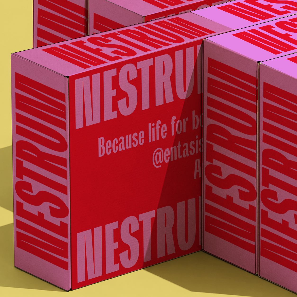
Its natural territory is display typography: wide headlines, signage, posters, spatial identities, covers and campaign pieces where the word shape needs to create a clear visual field.
Font in use
Type Tester
Text specimen
Paragraph rhythm
Typography gives form to ideas, shaping how they are perceived and understood. In a contemporary specimen, paragraph rhythm reveals spacing, texture, weight and tone with more precision than a single display word. This column tests an editorial measure: long enough to create a stable reading surface, narrow enough to expose the movement of words, punctuation, accents and figures across successive lines. The goal is to see whether the typeface can sustain a convincing texture through sentences of different lengths, with commas, clauses, proper names and occasional numbers interrupting the flow.
A paragraph exposes the real behaviour of a typeface: the density of counters, the cadence of repeated stems, the colour of punctuation, and the pressure created between one line and the next. In this middle column the text becomes a diagnostic surface, showing whether the family can remain calm when the copy grows denser and the justification begins to distribute space across the measure. If the rhythm is good, the reader does not notice the mechanism; the column simply becomes an even fabric of language, with enough variation to stay alive.
When the measure changes, the same design can become calm, tense, economical or expansive. Short lines reveal spacing, long lines reveal endurance, and justified columns reveal typographic mass. The final column adds another layer of comparison: repeated lowercase forms, numerals, capitals and diacritics should build a consistent page colour without flattening the personality of the typeface. Good text typography is not neutral in the sense of being absent; it is present with restraint, allowing meaning, hierarchy and atmosphere to develop together.
Small columns test discipline. Accents, figures, punctuation and word spacing must hold together without becoming noisy or uneven. At this scale, small defects become visible quickly because every line is short and every word boundary matters. The column asks for economy, clarity and an even grey value.
Extended settings ask the line to carry more air. Wide capitals, open counters and 0123456789 need to remain composed, especially in names, dates and short identity phrases where every horizontal decision is visible.
A narrow setting shows whether the design can absorb awkward words, dates, proper names and short fragments. Madrid 2026, Valencia, Hamburg, editions, catalogues and interfaces all create different pressures on spacing and justification. The paragraph should still feel composed.
Wide rhythm can become theatrical quickly. This column keeps it practical: captions, identity notes, editorial openers and display fragments should hold their breadth without losing alignment, tone or typographic colour.
Figures, capitals and lowercase forms work together to create texture, rhythm, emphasis and hierarchy. A premium specimen should let the reader compare these relationships without distraction, decoration or artificial effects. The typography itself must carry the page and prove its range.
Wide sample: posters, identity, openers · Aa Bb Cc · Madrid, Valencia, Hamburg. The final note checks horizontal tension, figures and punctuation in a compact column where breadth still has to behave.