Airegin Variable treats width, weight and slant as editorial material rather than separate effects. A paragraph can become narrower, heavier, lighter or more oblique while keeping the same underlying voice, so the system can respond to hierarchy, screen size and emphasis with restraint. This wide setting tests continuity: punctuation should not drift, figures should keep their place, and the rhythm of lowercase text should remain stable as the family moves through its range. The value is not spectacle, but control: one recognisable grotesque texture adapting to headlines, labels, captions and long information with the same measured presence.

AIREGIN FAMILY
Choose a licence
Editorial Overview
Airegin Family is a coordinated variable grotesque system with weight, width and bidirectional slant for responsive identities, editorial hierarchy and digital products.
Built for designers who need control across editorial, identity and digital environments, it makes the family adaptable without leaving its precise grotesque voice.
Ideal for responsive identities, web typography, editorial systems and flexible brand tools.
Use it when a brand system needs one recognizable grotesque voice across headlines, UI labels, editorial text, campaigns and responsive layouts.
Font Family: Airegin Family
Classification: Grotesque Family
Release: 2025
Design: Guillermo Gil
Foundry: EntasisType
Form & Rhythm
Axis
Vector
Signal
Module
Condensed
NARROW
regular
Extended
Wide
Slanted
Backshift
DISPLAY
thin axis
Weight
Motion
Reverse
SYSTEM
Identity
Backslant
slant
Variable
Screen
Texture
Pressure
Cadence
Choose a licence
Technical Details
- Styles 54 static styles + 1 variable configuration
- Widths 18 Standard · 18 Condensed · 18 Extended
- Axes Weight, Width, Slant
- Axis ranges wght 50–180 · wdth 75–125 · slnt −14–14
- Slant positions Backslant · Upright · Italic
- Weights Thin · Light · Regular · SemiBold · Bold · Extrabold
- Glyphs 523 exportable glyphs
- Languages 34 languages verified
- OpenType 18 features: aalt · ccmp · locl · subs · sinf · sups · numr · dnom · frac · lnum · pnum · tnum · onum · c2sc · smcp · case · liga · calt
- License All-in-One / Custom through Airegin family
Typeface notes
Airegin Family turns weight, width and slant into a responsive typographic system.
Airegin Family brings the Airegin voice into a variable environment where weight, width, Slant and Backslant can be adjusted as part of the same typographic structure. The axes are not treated as effects, but as tools for hierarchy, emphasis and responsive composition.
The system is useful when a project needs one recognisable grotesque across many conditions: compact navigation, open headlines, editorial paragraphs, campaign typography, interface labels and large-format display. Its value lies in continuity across change.
Because the family can become narrow, wide, light, heavy, upright or inclined, it gives designers control over density and tone without leaving the underlying drawing. This makes it especially effective for identity systems, web products, cultural platforms and editorial tools.
In composition, Airegin Family should be used with clear axis decisions rather than constant variation. Small shifts can solve space and hierarchy; larger shifts can create display presence, motion or contrast between sections.
Its natural territory is adaptive typography: responsive layouts, brand systems, publications, interfaces and campaigns where the same typeface needs to behave differently while remaining visibly related.
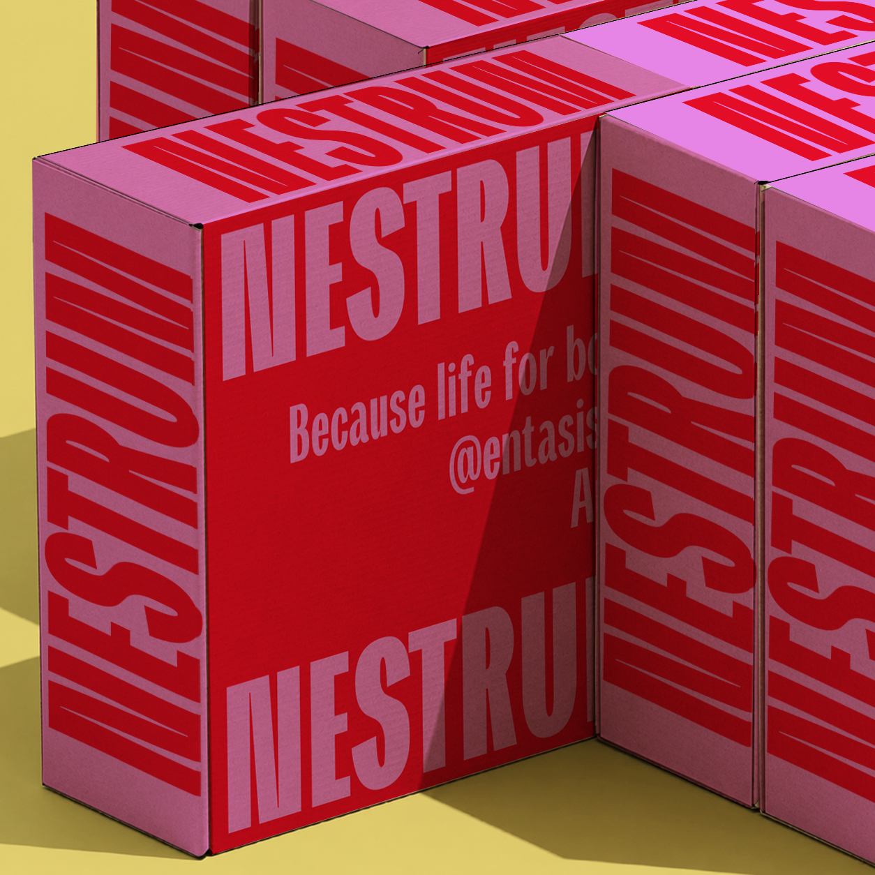
Font in use
Type Tester
Text specimen
Paragraph rhythm
Typography gives form to ideas, shaping how they are perceived and understood. In a contemporary specimen, paragraph rhythm reveals spacing, texture, weight and tone with more precision than a single display word. This column tests an editorial measure: long enough to create a stable reading surface, narrow enough to expose the movement of words, punctuation, accents and figures across successive lines. The goal is to see whether the typeface can sustain a convincing texture through sentences of different lengths, with commas, clauses, proper names and occasional numbers interrupting the flow.
A paragraph exposes the real behaviour of a typeface: the density of counters, the cadence of repeated stems, the colour of punctuation, and the pressure created between one line and the next. In this middle column the text becomes a diagnostic surface, showing whether the family can remain calm when the copy grows denser and the justification begins to distribute space across the measure. If the rhythm is good, the reader does not notice the mechanism; the column simply becomes an even fabric of language, with enough variation to stay alive.
When the measure changes, the same design can become calm, tense, economical or expansive. Short lines reveal spacing, long lines reveal endurance, and justified columns reveal typographic mass. The final column adds another layer of comparison: repeated lowercase forms, numerals, capitals and diacritics should build a consistent page colour without flattening the personality of the typeface. Good text typography is not neutral in the sense of being absent; it is present with restraint, allowing meaning, hierarchy and atmosphere to develop together.
Small columns test discipline. Accents, figures, punctuation and word spacing must hold together without becoming noisy or uneven. At this scale, small defects become visible quickly because every line is short and every word boundary matters. The column asks for economy, clarity and an even grey value.
Variable text asks for continuity. Weight, width and slant may change, but commas, accents, capitals and 0123456789 still need one stable rhythm. The family should adapt without making each adjustment feel like a new voice.
A narrow setting shows whether the design can absorb awkward words, dates, proper names and short fragments. Madrid 2026, Valencia, Hamburg, editions, catalogues and interfaces all create different pressures on spacing and justification. The paragraph should still feel composed.
Responsive typography depends on small transitions: a tighter label, a heavier tab, a backslanted marker, a quiet caption. Airegin Variable keeps these shifts inside one system, so hierarchy can change without breaking the page colour.
Figures, capitals and lowercase forms work together to create texture, rhythm, emphasis and hierarchy. A premium specimen should let the reader compare these relationships without distraction, decoration or artificial effects. The typography itself must carry the page and prove its range.
Axis sample: width, weight, slant · Aa Bb Cc · 0123456789 · Madrid, Valencia, Hamburg. The column checks whether flexible settings keep accents, figures and short editorial fragments aligned in a single typographic voice.