Museum and institutional identities
Its measured proportions and inscriptional presence can establish authority across names, titles and formal communication.
Arquivolta brings inscriptional structure and neoclassical contrast into a complete editorial family for cultural identity, publishing and formal communication.
It balances historical proportions with sharp, modern detailing. The serifs are crisp, the contrast pronounced but functional, and the overall texture on the page exudes authority and sophistication.
Designed for cultural identity, editorial headlines and formal packaging where heritage and precision are required.
Use it when cultural, editorial or premium identity systems need historical authority, refined contrast and a contemporary serif voice.
Font Family: Arquivolta
Classification: Transitional Serif
Release: 2025
Design: Guillermo Gil
Foundry: EntasisType
Arquivolta brings inscriptional memory into contemporary editorial and identity typography.
Arquivolta is shaped by the authority of Roman inscriptional forms and the refinement of neoclassical typography. Its contrast, sharp serifs and measured proportions give text a ceremonial presence without turning every setting into a monument.
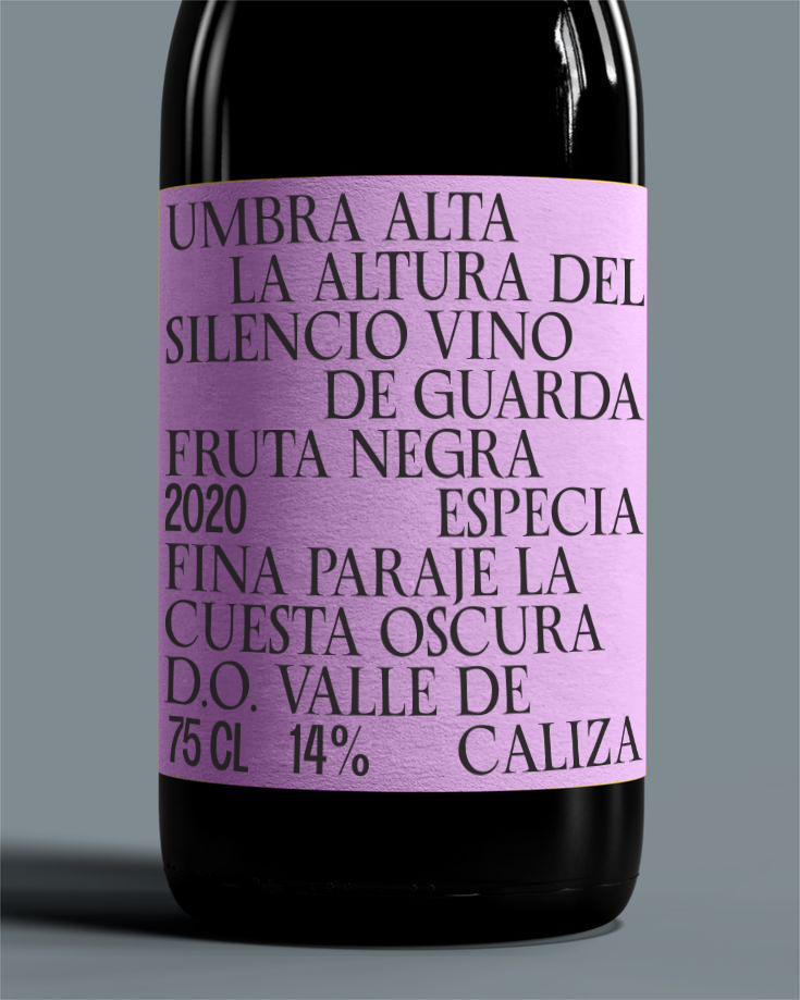
The family is designed for cultural, editorial and premium contexts where history needs to remain active rather than nostalgic. It can carry museum identities, book covers, catalogues, packaging, institutional communication and refined brand systems.
Its strength lies in the balance between historical memory and contemporary control. The letters have enough contrast and detail to create distinction, while the spacing and rhythm keep them useful in headings, short paragraphs and composed editorial surfaces.
In composition, Arquivolta benefits from generous leading, careful hierarchy and respect for contrast. It can support text settings, but it is most persuasive when the layout allows its serifs, capitals and italics to build a refined page colour.
Its natural territory is cultural typography: titles, covers, catalogues, exhibitions, premium packaging, editorial openers and identity systems where elegance, authority and typographic precision need to work together.
Arquivolta gives cultural and editorial systems an inscriptional serif voice shaped for contemporary composition.
Arquivolta is intended for projects where historical memory must remain active rather than nostalgic. Roman inscriptional forms and neoclassical refinement inform its contrast, sharp serifs and measured proportions, giving titles and composed text a sense of authority without making every setting monumental.
The family balances distinction with control. Its capitals, serifs and italics can establish a recognisable identity, while its spacing and rhythm support headings, short paragraphs and structured editorial surfaces. This allows designers to build hierarchy without separating expressive and supporting typography into unrelated voices.
Arquivolta is most persuasive when a system can give its details room to work. Generous leading, careful hierarchy and considered scale allow it to move between identity, editorial and institutional communication while maintaining a refined and coherent page colour.
Cultural and premium systems where hierarchy, historical memory and typographic precision need to work together.
Its measured proportions and inscriptional presence can establish authority across names, titles and formal communication.
Covers, openers, headings and short text settings can share a refined hierarchy built through contrast, scale and spacing.
Distinctive capitals and controlled rhythm give cultural titles presence while supporting structured secondary information.
Serifs, contrast and careful proportions provide a formal voice for packaging systems that rely on typographic detail.
OpenType details
Arquivolta includes a stylistic set for A, F, G, H, M, Q and d, together with discretionary ligatures designed for selected display settings.
Use these forms selectively at display sizes. The Type Tester below lets you compare the standard alphabet, decorative alternates and ligatures while adjusting measure, alignment, tracking and leading.


Text specimen
Arquivolta carries inscriptional memory into a contemporary reading surface. Its neoclassical contrast gives cultural texts, catalogues and institutional voices a sense of authority without turning the paragraph into a monument. This wide setting tests how that authority behaves in continuous language: capitals should feel composed, lowercase forms should keep movement, and punctuation must interrupt the line with precision rather than ornament. Names such as Madrid, Valencia and Hamburg add accents, rhythm and civic weight to the texture. The page should feel measured, articulate and durable, with enough contrast to create presence and enough restraint to sustain editorial use.
Typography gives form to ideas, shaping how they are perceived and understood. In a contemporary specimen, paragraph rhythm reveals spacing, texture, weight and tone with more precision than a single display word. This column tests an editorial measure: long enough to create a stable reading surface, narrow enough to expose the movement of words, punctuation, accents and figures across successive lines. The goal is to see whether the typeface can sustain a convincing texture through sentences of different lengths, with commas, clauses, proper names and occasional numbers interrupting the flow.
A paragraph exposes the real behaviour of a typeface: the density of counters, the cadence of repeated stems, the colour of punctuation, and the pressure created between one line and the next. In this middle column the text becomes a diagnostic surface, showing whether the family can remain calm when the copy grows denser and the justification begins to distribute space across the measure. If the rhythm is good, the reader does not notice the mechanism; the column simply becomes an even fabric of language, with enough variation to stay alive.
When the measure changes, the same design can become calm, tense, economical or expansive. Short lines reveal spacing, long lines reveal endurance, and justified columns reveal typographic mass. The final column adds another layer of comparison: repeated lowercase forms, numerals, capitals and diacritics should build a consistent page colour without flattening the personality of the typeface. Good text typography is not neutral in the sense of being absent; it is present with restraint, allowing meaning, hierarchy and atmosphere to develop together.
Small columns test discipline. Accents, figures, punctuation and word spacing must hold together without becoming noisy or uneven. At this scale, small defects become visible quickly because every line is short and every word boundary matters. The column asks for economy, clarity and an even grey value.
Inscriptional rhythm becomes useful when it can enter ordinary text. Capitals, accents and figures need authority without stiffness: Madrid 2026, catalogue notes and museum captions should all keep a calm, public cadence.
A narrow setting shows whether the design can absorb awkward words, dates, proper names and short fragments. Madrid 2026, Valencia, Hamburg, editions, catalogues and interfaces all create different pressures on spacing and justification. The paragraph should still feel composed.
For cultural and editorial work, tone is built line by line. Exhibition titles, wall texts, colophons and archive notes require contrast, spacing and punctuation to agree before the page can feel authoritative.
Figures, capitals and lowercase forms work together to create texture, rhythm, emphasis and hierarchy. A premium specimen should let the reader compare these relationships without distraction, decoration or artificial effects. The typography itself must carry the page and prove its range.
Archive sample: 0123456789 · Aa Bb Cc · Madrid, Valencia, Hamburg. The compact note tests serif contrast, civic names, accents and punctuation within a restrained editorial texture.